Hodos is a travel application that allows travellers to approach travel planning in a new fashion.
Build a mobile application that helps people plan their next trip, post-pandemic.
Conducted user research, wireframing, low-fidelity, and high-fidelity prototyping, and user testing.
This project was completed within the span of 2 weeks
Passionate about travel and design, I often use apps like Airbnb and Uber, each excelling in a single aspect of travel. Airbnb's focus lies in providing accommodations for its users, while Uber focuses on providing transportation solutions to their users. I wanted to create a comprehensive travel app for travelers covering all aspects of the planning journey.
In 2019, before the COVID-19 pandemic, Airbnb reported a GBV (Gross Booking Value) of $38 billion. Uber reported $49 billion in GB (Gross Booking) in 2019. Understandably with worldwide lockdowns, these numbers took a hit during the pandemic which began in March of 2020. However, since then there has been a travel resurgence with people being confined to their homes for almost two years people have been excited to travel more than ever.
According to the United National World Tourism Organization, in 2022 global tourism experienced a significant rebound with international arrivals more than doubling from the previous two years. This trend has continued through 2023, as stated by Airbnb's Q3 report GBV has already hit $58 million, while Uber reported $35 billion showing both companies are on track to meet or exceed pre-pandemic numbers. As the volume of travel continues to rise, so does the demand for an effective and efficient travel planning process. Additionally, the competition amongst applications within travel will intensify making an application's onboarding experience even more important.
My primary focus is user onboarding due to user drop-off during the initial exploratory stages of applications. I aim to address this phase to enhance user retention and engagement.
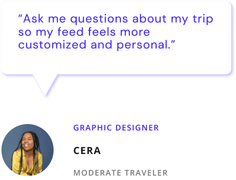
I conducted research with 5 moderate to frequent travelers and tested an early low-fidelity prototype. The goal was to explore what features they seek during onboarding into new travel applications, given their experience with various planning tools.
The identities of the depicted individuals have been concealed to uphold the integrity and focus of the research.
To get to my final design, I went through multiple rounds of iterations from my testing outcomes.
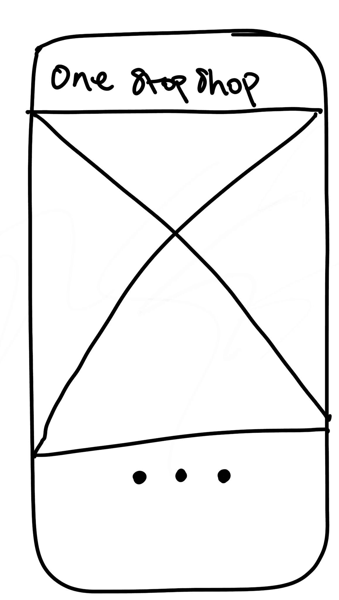
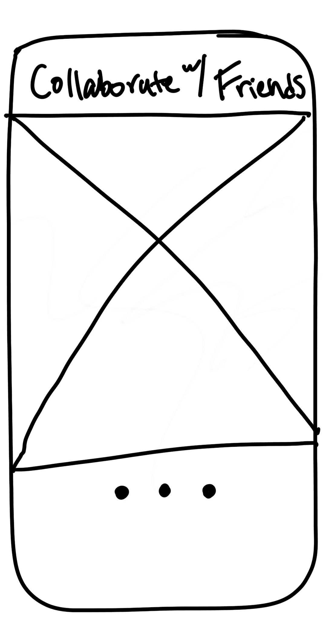
Sketches - 01
I started my design process with sketches to get my ideas on paper. I was looking to capture the application's key features with images that gave insight into the experience they were going to have using the application.
In this version, I incorporated images and copy to help users familiarize themselves with the app's features while forming their initial impression. Through user testing, I discovered that the progress indicators weren't clear enough for users to understand they could swipe to navigate. To address this, I introduced a "continue" button as an additional cue, reducing confusion during screen transitions.
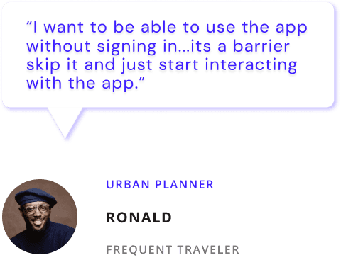
In my research, I found that users prefer starting the app quickly over onboarding. For those who engage, they expect a brief and useful experience. I designed interactive onboarding screens allowing users to grasp main functions while planning a trip for their first trip. Post-onboarding, the app offers tailored suggestions to assist planning. Users can still skip onboarding if they prefer.
I found that when users interacted with the prototype on a mobile device the navigation confusion disappeared immediately, allowing me to remove the "continue" button.
In previous iterations, user testing revealed that many people struggled to read text overlaid on visuals, prompting me to assess font accessibility. This assessment showed that the design did not meet accessibility standards.
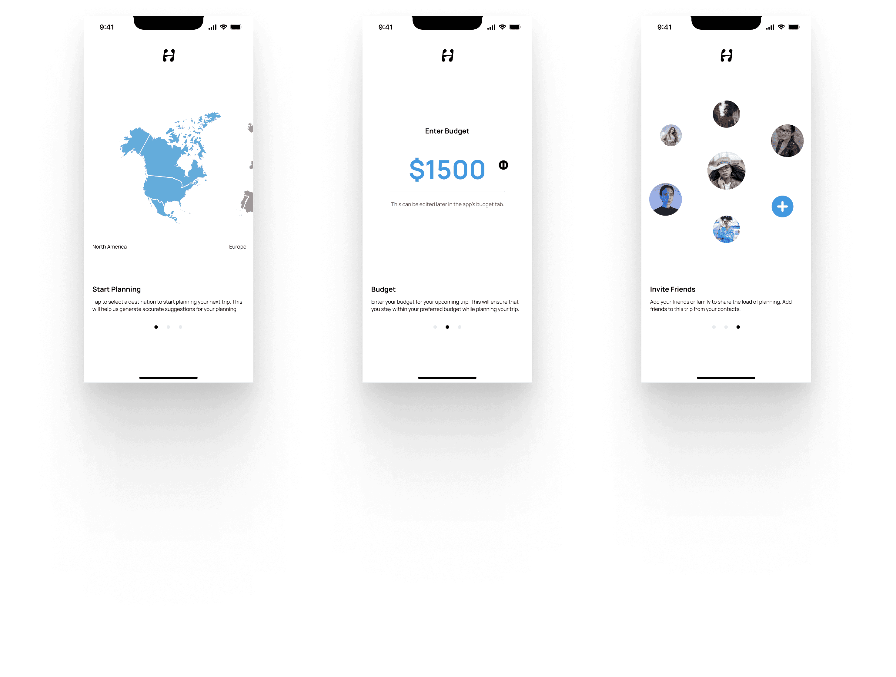
Lastly, I noticed that users seemed to take a while to take their next action. I wanted them to be able to have a very short yet engaging experience during onboarding. However, while doing that I realized I presented too many options causing analysis paralysis. At this stage, during each interactive onboarding screen, the user could also read the short text, create an account, log in, and skip onboarding.
9:41
North America
Europe
Asia
South America
Africa
Australia
Start Planning
Tap to select a destination to start planning your next trip. This will help us generate accurate suggestions for your planning.
Create an Account
Log In
SKIP
9:41
Enter Budget
Enter your budget for your upcoming trip. This will ensure that you stay within your preferred budget while planning your trip.
This can be edited later on in the app in the budget tab of the application
Create an Account
Log In
SKIP
Budget
$1500
9:41
Invite Friends
Add your friends or family to share the load of planning. Add friends to this trip from your contacts.
Create an Account
Log In
SKIP
In the final design, I crafted an interactive experience that gathered user data for personalization, while simultaneously offering education and a glimpse into the app's key features. Importantly, users were not forced to create an account, and they retained the choice to skip onboarding after a brief delay, ensuring data capture without imposition.
Start the design process by simplifying the process. Just because the number of screens is reduced does not mean users are not overwhelmed with information and options.
Although I allowed users to take control of how they wanted to experience onboarding through guidance or exploring on their own within the app, onboarding is a process that will continue to evolve as the user's needs change. So I believe I can take this a step further and allow users to customize the onboarding experience to their preferences.
